Micro-interactions are those tiny design elements that respond to user actions in subtle ways. Think button animations, toggles that slide smoothly, or a heart icon that pulses when clicked. They’re not decorative fluff — they’re feedback tools, behavior shapers, and attention retainers.
These tiny moments can drastically improve how people feel using a product. Done right, they make interfaces feel alive and responsive without users even noticing why. That’s the power: invisible satisfaction.
Why Micro-Interactions Matter
Users judge experience by feel. They remember friction, and they remember delight. Micro-interactions smooth rough edges and provide that split-second joy that keeps people clicking, swiping, and scrolling.
Key reasons micro-interactions work:
- Feedback: They confirm actions. A subtle shake tells you a password is wrong. A loading bar shows progress.
- Guidance: They hint at functionality. A bouncing arrow suggests there’s more content below.
- Control: They show the system is listening. Tap a button, and it responds instantly.
- Personality: They give a brand tone. A custom cursor or snappy animation builds identity.
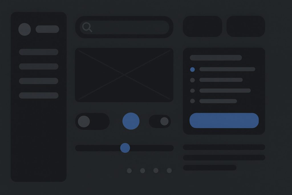
Core Elements of a Micro-Interaction
Every micro-interaction has four parts:
- Trigger: What initiates it (e.g., clicking, hovering, swiping).
- Rules: What happens during the interaction.
- Feedback: What users see, hear, or feel as a result.
- Loops and Modes: What keeps it running or modifies it based on context.
Mastering these parts helps create smoother flows and more intuitive interfaces.
Practical Use Cases That Work
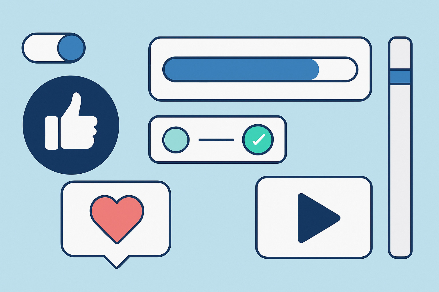
1. Like Buttons with Animation
A static icon is functional. But one that animates adds a bit of joy. It also confirms action instantly without relying on page reloads or notifications.
2. Swipe Indicators
Apps like Tinder or Gmail use these to show users how to perform gestures. Color-coded icons or fading text as a swipe begins gives instant clarity.
3. Progress Feedback
Whether it’s a spinner or a progress bar, feedback matters. It reduces abandonment during wait times.
4. Hover Effects on Cards or Buttons
Small shifts, color changes, or shadow effects on hover improve usability. They guide attention and reduce errors.
5. Input Validation on the Fly
Typing an email address and seeing a checkmark appear adds confidence. It prevents form submission errors and frustration.
Design Tips That Make Micro-Interactions Work
- Keep it fast. Anything above 200 milliseconds feels sluggish. Aim for sub-150ms response times.
- Be subtle. Flashy animations distract more than help. Use ease-in/ease-out motion curves.
- Think mobile-first. Tap targets need to respond visually. Tactile feedback (vibration) also works well.
- Stay consistent. Use the same interaction styles across components to reduce learning curve.
- Add personality but don’t force it. A chuckle-worthy checkbox animation might be great for a gaming app, but not for online banking.
Mistakes to Avoid
- Overuse. Don’t animate everything. Users will feel overwhelmed and exhausted.
- Performance hit. Poorly coded micro-interactions lag or crash older devices.
- Lack of accessibility. Ensure screen readers and keyboard inputs still function correctly.
- Inconsistency. Different behavior across screens confuses users and breaks trust.
Metrics to Track Impact
Once micro-interactions are in place, measure their effect:
- Bounce rate: Are people staying longer on interactive pages?
- Click-through rate: Are engagement elements like toggles and buttons getting used more?
- Form completion rate: Are validation helpers increasing success rates?
- User satisfaction: Qualitative feedback often mentions how “smooth” or “fun” a site feels — that’s your cue.
Final Thoughts
Micro-interactions might seem minor, but they play a major role in shaping user experience. They make interfaces feel alive, reduce confusion, and spark just enough delight to keep people engaged without distraction. When integrated thoughtfully, they turn static designs into dynamic conversations.