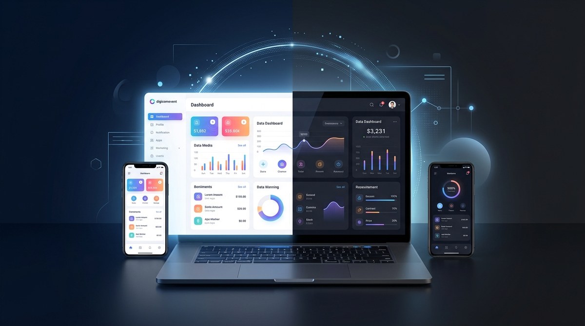
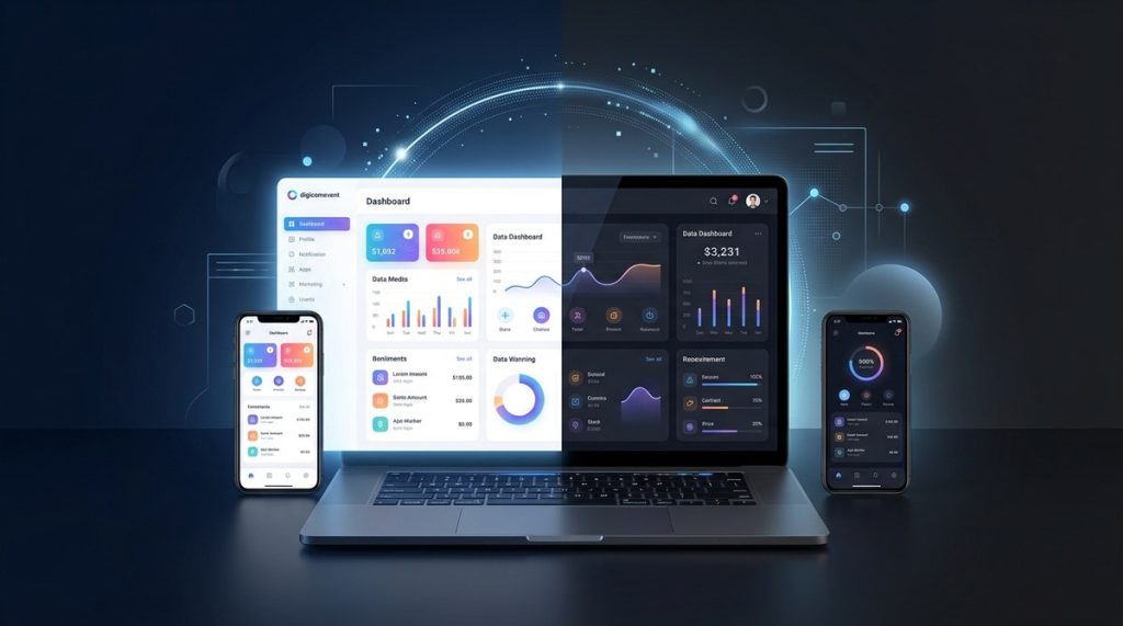
Imagine stepping into a digital experience that feels calmer yet more focused. Dark mode is widely embraced not just as a visual preference but as a thoughtful design approach that can boost readability, reduce eye strain, and align with how people use devices in different contexts. For a digital agency like DigiComEvent, mastering dark mode is more than a color switch. It is part of a comprehensive UI strategy that respects user context, strengthens brand perception, and supports accessible, responsive experiences. In this article we explore the benefits of dark mode in modern UI design, practical tips for implementation, and how to weave this design choice into your web design and marketing strategy.
Why dark mode matters in modern UI design
Dark mode is not merely a cosmetic change. It affects how users perceive content, how interfaces guide attention, and how energy is consumed on certain devices. When designed thoughtfully, dark mode can improve usability while expanding the reach of your digital products.
The core benefits at a glance
- Improved readability in low light and night time contexts
- Reduced eye strain during extended screen time
- Enhanced focus on primary content by increasing contrast with backgrounds
- Potential energy savings on OLED and AMOLED displays
- Expanded accessibility options for users with light sensitivity
- Stronger brand differentiation through a distinctive visual language
These benefits are not universal and depend on thoughtful execution. The goal is to support content clarity, maintain color harmony, and respect user preferences rather than simply applying a dark palette.
Accessibility and inclusivity
Dark mode can improve accessibility when implemented with proper contrast and typography choices. For some users, dark backgrounds reduce glare and make content easier to read. For others, especially those with certain visual impairments, carefully tuned contrast and color choices are essential. The key is to design with WCAG guidance in mind and to provide a reliable toggle or system preference respect so users can choose the mode that works best for them.
Energy efficiency and environmental impact
On devices with energy efficient screens like OLED or AMOLED, dark interfaces can consume less power when dark pixels are displayed. This advantage varies by hardware and usage patterns, but for apps and websites with deep black surfaces, it can contribute to overall energy savings. Think of energy considerations as a possible benefit rather than a guaranteed outcome for all devices.
Brand personality and emotional resonance
Dark mode offers a chance to express a brand voice that is sleek, modern, and futuristic. It can be used to highlight photography, data visualizations, or typography with bold presence. The interplay of light text on a dark surface can amplify call to action and content hierarchy when done with discipline.
How dark mode improves user experience
Readability and glare reduction
- High contrast between text and background improves legibility in dim environments
- Careful font sizing and line length remain critical to readability
- Avoids bright white glare that can cause fatigue in low light
Focus and cognitive load
- Dark surfaces help reduce visual clutter by allowing content to breathe
- Primary actions and important information can be highlighted with color accents
- Subtle elevation cues and shadows should be used carefully to preserve readability
Contextual awareness and content priority
- Dark mode can emphasize media heavy content such as code blocks, charts, and images
- Color choices should guide attention without overwhelming the user
- Consistency across screens helps users predict interactions
Practical benefits by category
Platform and devices
- Web and mobile apps must adapt to different input methods, screen sizes, and viewing conditions
- Desktop displays often support richer color depth and contrast ranges
- Mobile devices frequently transition between bright and dark environments
- Supporting both light and dark modes with a reliable toggle improves cross platform consistency
Build and design systems
- Define a robust color system with tokens for surfaces, text, borders, and accents
- Establish contrast ratios that meet accessibility standards
- Use semantic color roles rather than hard coded color values to simplify maintenance
- Ensure components such as buttons, inputs, and cards render correctly in both modes
Manage and maintain
- Integrate dark mode into your design system and component library
- Allow users to select a theme or follow system preferences
- Use theming to adjust not only colors but also typography, icons, and shadows
Optimize performance and user experience
- Minimize repaint and reflow during theme switching
- Precompute theme assets where possible to reduce runtime costs
- Test rendering on a range of devices and lighting conditions
Extend and innovate
- Leverage AI to suggest color palettes that harmonize with dark mode
- Personalization can tailor mode and accents to user preferences while respecting privacy
- Consider data visualization palettes that remain legible in both modes
How to implement dark mode in modern UI design
Step 1: Define your color system
- Create color tokens for surfaces (backgrounds, cards, panels), text (primary, secondary, muted), borders and dividers, and interactive elements (buttons, toggles, inputs)
- Establish a clear light mode and a corresponding dark mode palette
- Ensure brand colors retain legibility and emotional impact in both modes
Step 2: Set reliable contrast targets
- Small text should meet at least 4.5 to 1 contrast against its background
- Large text and user interface components can aim for 3 to 1 contrast
- Ensure icons and glyphs have sufficient contrast against their backgrounds
Step 3: Build a responsive design system
- Use design tokens that can switch themes without breaking layout
- Implement CSS variables or a theming engine to toggle themes globally
- Maintain consistent spacing, typography, and elevation across modes
Step 4: Create a toggle and respect system preference
- Provide a user facing toggle to switch themes
- Respect the system theme preference to offer an automatic default
- Remember user choice across sessions with persistent storage
Step 5: Test across devices and environments
- Evaluate readability in bright daylight and in dark rooms
- Test on multiple browsers and operating systems
- Validate accessibility with assistive technologies like screen readers
Step 6: Iterate with real world feedback
- Collect user feedback on readability and aesthetic appeal
- Run A/B tests to measure engagement and clarity
- Refine color tokens and typography based on data
Real world examples and case studies
- A media site uses dark mode to highlight photography and color driven stories
- A developer focused platform leverages dark theme to reduce glare in long coding sessions
- An analytics dashboard balances bright data visualizations with dark surfaces for reduced eye strain
- An e commerce storefront uses a dark backdrop to accentuate product imagery while maintaining legibility of call to action buttons
These examples illustrate how dark mode can be tailored to different content types and user goals. The common thread is thoughtful contrast, consistent theming, and an emphasis on content priority.
Common pitfalls to avoid
- Using pure black or pure white as surfaces
- Over saturating background accents which reduce legibility
- Poor contrast on text or icons with certain color pairings
- Inconsistent elevation or shadows that distract rather than support hierarchy
- Forcing dark mode on every brand asset without considering content context
Addressing these issues early helps prevent user frustration and preserves a premium user experience.
Best practices and practical tips
- Use color intentionally to guide attention rather than to decorate
- Prefer desaturated or nuanced hues for backgrounds to reduce eye fatigue
- Reserve high contrast for interactive elements and critical information
- Ensure icons and glyphs have complementary contrast in both modes
- Test with real users, including people with visual impairments
Accessibility and compliance considerations
- Follow WCAG 2.1 guidelines for color contrast and text readability
- Ensure keyboard navigability remains consistent across themes
- Provide meaningful focus indicators that are visible in both light and dark modes
- Validate screen reader labeling and aria attributes stay accurate when themes switch
Measuring success and impact
- User engagement metrics such as session duration, return visits, and interactions with content
- Accessibility compliance metrics including contrast ratio pass rates
- Performance indicators like time to interactive and time to first paint after theme switches
- Qualitative feedback from user testing and support inquiries
Content strategy alignment for DigiComEvent
DigiComEvent.com is a digital agency focusing on web design, marketing, and strategy. A comprehensive guide on dark mode supports our audience by:
- Demonstrating design systems discipline and practical implementation steps
- Providing actionable insights for clients who want to optimize UX across platforms
- Positioning DigiComEvent as a thought leader in responsive design and dark mode interfaces
- Showcasing how design decisions align with branding, accessibility, and performance
In future posts we can delve into topics like:
- Dark mode for e commerce experiences
- Data visualization in dark mode dashboards
- Content management strategies for theming
- Tools and workflows for efficient theme maintenance
How to leverage dark mode in your strategy
- Include a clear plan for when to use dark mode and when to stay in light mode
- Integrate theme decisions into your design system and style guide
- Align visual language with brand narrative while maintaining accessibility
- Use analytics to measure user preference shifts and engagement under different themes
- Offer customers a seamless experience that respects their environment and device
Practical implementation checklist
- Audit your current UI for color and contrast gaps
- Define a robust token system for surfaces, typography, and controls
- Create light and dark palettes with harmonized shades
- Build a theme switch with system preference respect
- Test extensively across devices, environments, and assistive tech
- Gather feedback and iterate on palette choices and typography
- Document decisions in your design system for future reuse
Industry insights and trends
- The rise of personalized theming while balancing privacy and performance
- The importance of accessibility driven by legal and ethical considerations
- The role of dark mode in immersive content experiences such as media and gaming
- The continuous refinement of color science for dual mode usability
FAQ
- Is dark mode better for every site? Not necessarily. It depends on content, audience, and context. Use dark mode to complement content that benefits from reduced glare or enhanced imagery.
- Does dark mode save energy on all devices? Energy savings are most noticeable on OLED and AMOLED displays. Other screen technologies may see smaller benefits.
- How do I ensure accessibility in dark mode? Prioritize contrast, legibility, and accessible interactive elements. Test with assistive technologies and follow WCAG guidelines.
The DigiComEvent commitment
At DigiComEvent, we believe that a well designed dark mode is part of a larger strategy that includes responsive design, performance optimization, and accessible aesthetics. Our team helps brands craft digital experiences that are not only visually compelling but also inclusive and effective. If you are considering a dark mode initiative for your website or app, our consulting and design services can guide you from strategy through implementation to measurement.
Conclusion
Dark mode is more than a trend; it is a design approach with real impact on usability, accessibility, and brand perception. When implemented with careful attention to contrast, typography, and user context, dark mode can elevate your UI to deliver calmer, more focused experiences without sacrificing content clarity. By treating dark mode as a system wide design decision rather than a cosmetic option, you can unlock meaningful improvements in engagement and accessibility across web and mobile experiences.
If you would like expert guidance on implementing dark mode within your web design or marketing strategy, DigiComEvent is here to help. Reach out to discuss how we can tailor a dark mode strategy that fits your brand, audience, and goals.