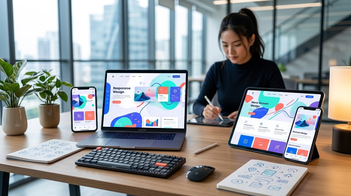
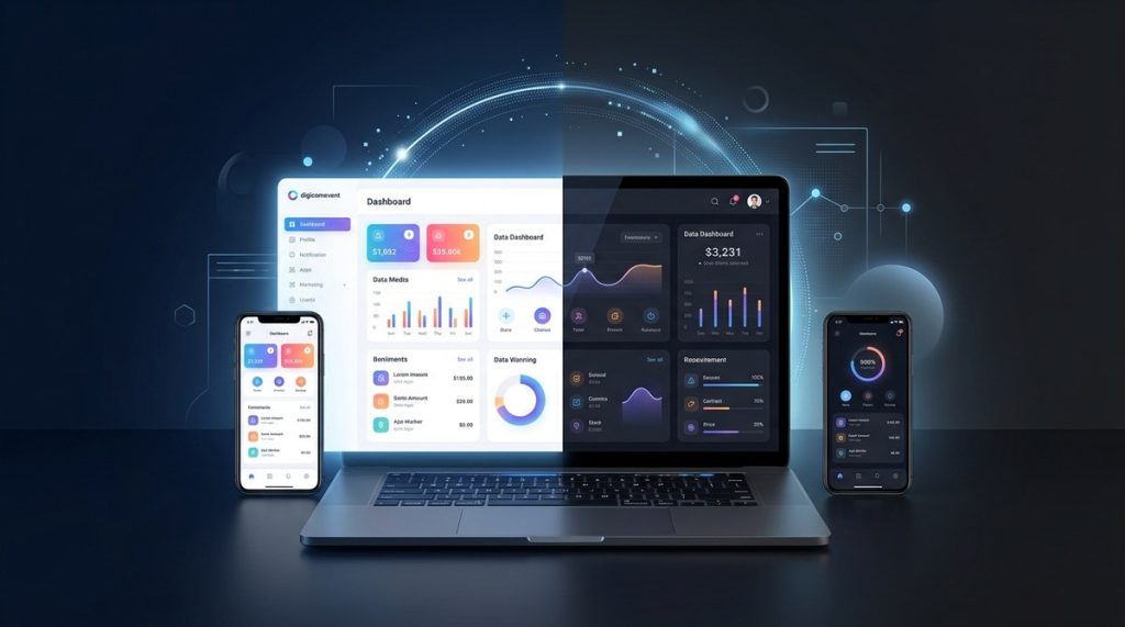
In 2026 the web has grown more multi device and multi context than ever before. People switch between phones tablets laptops and even TVs and smart displays in the same hour. Users expect fast loading experiences that look and feel right no matter the screen size. This is where responsive design moves from a nice to have to a strategic must have. At DigiComEvent we help brands and agencies create websites that adapt gracefully to every device while delivering solid performance accessibility and conversions. In this guide we will walk you through practical steps to design a responsive website in 2026 that stands out and performs.
Why responsive design matters in 2026
Responsive design is not just about resizing a page. It is about shaping experiences that respect user intent across contexts. The pandemic pushed many buyers to search and shop on mobile devices first and search engines followed suit with mobile first indexing and Core Web Vitals consideration. In 2026 the most successful websites combine a mobile first mindset with component based design and robust performance practices.
Key reasons to invest in responsive design today:
– Improved user experience across devices reduces bounce and increases engagement
– Better SEO results thanks to mobile first indexing and faster page performance
– Consistent branding and messaging across screen sizes
– Ability to leverage design systems and tokens for faster production and easier maintenance
– Accessibility becomes a natural part of design rather than an afterthought
The core building blocks of a responsive website
Fluid grids and flexible layouts
A strong responsive foundation begins with a grid that adapts to content rather than the other way around. Fluid grids use relative units like percentages and minmax values to scale. Techniques to consider:
– Use CSS Grid for two dimensional layouts that adjust flow with the container size
– Use Flexbox for one dimensional alignment and distribution
– Prefer native CSS containers that expand and contract with content
– Avoid fixed pixel widths for major layout containers
CSS Grid and Flexbox in action
CSS Grid and Flexbox are not competing paradigms. They are complementary tools:
– Grid is ideal for overall page structure: header, content columns, sidebars
– Flexbox excels at aligning items within a row or column and distributing space
– Combine both: grid defines major regions, while flex is used inside components for precise alignment
Container queries and component based design
Container queries are a game changer in 2026. They allow a component to adapt based on the size of its own container rather than the viewport. This unlocks truly modular components that reflow predictably when embedded in different parts of a page.
– Build components that respond to their parent width
– Create adaptable cards nav items and widgets that stay legible on any container
– Pair with a design system to ensure consistency across breakpoints
Fluid typography and spacing
Typography and spacing should scale with the viewport while maintaining readability. Use modern CSS functions to achieve this:
– clamp(min font size, preferred fluid size, max font size) for font sizes
– fluid line height and responsive letter spacing
– consistent rhythm with CSS custom properties (design tokens)
Images and media that scale gracefully
Images are critical for performance and layout stability. Techniques to embrace:
– Use srcset and sizes to deliver appropriate image variants
– Prefer vector graphics or inline SVG icons for clarity at any scale
– Lazy load images that are off screen
– Use picture element for art direction and bandwidth efficiency
The viewport meta tag and accessibility basics
The viewport tag is essential for controlling how your site scales on mobile. A robust setup includes:
– width device width
– initial scale 1
– user scalable yes or no depending on context
Accessibility basics that align with responsive design:
– readable contrast levels across themes including light and dark
– sufficient touch target sizes on small screens
– animated motion respects user preferences and is not overwhelming
Designing a mobile first strategy for 2026
Mobile first design means starting the design process with the smallest accessible screen and progressively enhancing for larger sizes. This approach often yields faster initial load times and better prioritization of content.
Key steps to implement a mobile first strategy:
1. Prioritize core content and actions for small screens
2. Build from a solid base with a clean grid and scalable typography
3. Use progressive enhancement to add richer interactions on larger viewports
4. Implement container based components to maintain consistency across contexts
5. Test frequently on real devices to validate user experience
Building blocks in practice
Breakpoints that follow content
Traditional breakpoints based on device sizes can cause unnecessary constraints. In 2026 a content driven breakpoint approach works best:
– Define breakpoints by where the content needs a layout change
– Avoid stuffing every device size into a separate breakpoint
– Use container queries to adjust components at the right moments
Designing for dark mode and light mode
Dark mode is not optional anymore. It improves readability and reduces eye strain in many contexts. Design for both modes from the start:
– Use color tokens that adapt with a dark mode scheme
– Ensure text remains readable against variable backgrounds
– Test imagery and icons to avoid low contrast on dark backgrounds
Typography that scales across devices
Fluid typography prevents jarring jumps in text size as the screen changes:
– Use clamp for font sizes to stay within comfortable reading ranges
– Scale line lengths through width constraints to maintain readability
– Create a typographic scale that your design system uses across components
Responsive navigation patterns
Navigation must adapt elegantly to different screens:
– Consider a compact horizontal menu on large screens
– Transform into a simplified stacked or collapsible menu on small screens
– Ensure that primary actions remain accessible regardless of the menu state
Accessibility and inclusive design in responsive sites
Accessibility should not be an afterthought. Responsive design naturally supports inclusive experiences when planned properly.
– Ensure color contrast meets WCAG guidelines in all modes
– Make sure focus states are visible and consistent across breakpoints
– Provide keyboard friendly navigation and meaningful focus order
– Use semantic HTML and ARIA roles where appropriate
– Test with assistive technologies and real users with diverse needs
Performance optimization and SEO alignment
Performance and SEO are tightly linked in 2026. Responsive design plays a critical role in both.
– Optimize Core Web Vitals: LCP, CLS, and FID through lazy loading, optimized assets, and stable layouts
– Design for speed with minimal CSS and JavaScript, and avoid render blocking resources
– Serve appropriately sized images to reduce network payloads
– Use preconnect and resource hints to speed up critical third party requests
– Leverage a responsive design system to reduce duplication and improve caching
From an SEO perspective:
– Mobile friendly is a given due to mobile first indexing
– Fast load times influence rankings and user satisfaction
– Clear content hierarchy helps search engines understand page importance
The practical workflow for building a responsive site
1. Define goals and user contexts
Before writing code, clarify the core actions your users perform on the site and the devices most commonly used.
2. Establish a design system
A design system provides tokens for color typography spacing and component rules. This brings consistency across pages and enables faster iteration.
3. Create a component library with container based logic
Build reusable components that can respond to their container width. This reduces layout complexity and supports adaptive experiences.
4. Implement responsive layout patterns
- Use CSS Grid for page structure
- Use Flexbox for in component alignment
- Apply container queries for component level adaptation
5. Optimize images and media
Prepare multiple image variants and serve them using the most appropriate method for the viewport and network conditions.
6. Integrate accessibility from the start
Check color contrast ensure focus indicators are visible and validate keyboard navigation.
7. Test across devices and contexts
Test on real devices and use emulators for additional coverage. Include performance testing.
8. Iterate with data
Monitor Core Web Vitals and user behavior data to refine layouts and interactions.
Testing and quality assurance for responsive experiences
Testing is essential to ensure that your responsive design works as intended.
Recommended testing approaches:
– Real device testing across a spectrum of devices and screen sizes
– Automated visual regression tests to catch layout shifts
– CSS and HTML validation to avoid structural issues
– Performance testing with Lighthouse or similar tools to verify LCP CLS and TBT targets
– Accessibility audits focusing on keyboard interaction and screen reader compatibility
Dark mode and theme aware design
In 2026 users expect websites to gracefully switch to dark mode. A truly responsive dark mode is not simply a color swap; it affects component shadows legibility and energy use on devices with OLED displays.
– Design color tokens that adapt consistently between light and dark
– Test imagery to ensure contrast remains strong in both modes
– Consider user preferences and provide an easy toggle if your platform supports it
– Ensure third party components and widgets honor the theme
The role of design systems and consulting services
A robust design system is a cornerstone of scalable responsive design. It helps teams work faster and deliver consistent experiences.
– Create a typography scale and spacing system aligned with breakpoints
– Build components that can adapt to various contexts with container queries
– Document usage guidelines and accessibility requirements
– Provide ongoing consulting to keep your system up to date with evolving web standards
DigiComEvent offers consulting services to help you implement a responsive design strategy from discovery through launch and beyond. We collaborate with brands to align design decisions with marketing and strategy goals, ensuring that responsive design translates into better conversions and user satisfaction.
Real world examples and patterns
While every site is unique, certain patterns consistently perform well in 2026:
– A modular grid that adapts to the content and container
– Cards and modules that can stack or align based on width
– Typography that scales smoothly and remains highly readable
– Images that balance quality and performance with responsive loading
– Clear calls to action that stay accessible across breakpoints
Common challenges and how to overcome them
- Challenge: Content looks great on desktop but feels cramped on mobile
- Solution: Start with the smallest viable layout and progressively enhance; use container queries to adjust components rather than forcing multiple fixed breakpoints
- Challenge: Unpredictable layout shifts when images load
- Solution: Reserve space for media using aspect ratio boxes and implement aspect ratio aware containers
- Challenge: Maintaining performance with many components
- Solution: Design with a lean design system; reuse components and optimize assets
A quick checklist for your 2026 responsive website project
- Define content first and map user journeys for mobile and desktop
- Design a scalable grid system with CSS Grid and Flexbox
- Implement container queries for component level responsiveness
- Build a robust accessible color system and typography
- Prepare responsive images with srcset and picture
- Optimize for Core Web Vitals with efficient loading strategies
- Ensure a seamless dark mode experience
- Test on real devices and with automated tools
- Document the design system and provide training for teams
- Plan ongoing improvements and performance audits
Why choose DigiComEvent for your responsive design needs
- We blend design strategy with practical engineering to deliver fast and accessible responsive sites
- Our approach emphasizes content driven breakpoints and container based design
- We help plan and implement dark mode and inclusive design from day one
- We provide ongoing consulting and support to evolve your website as devices and user expectations change
Conclusion
Designing a responsive website in 2026 is about building adaptable architectures that respect user context and performance. By applying fluid grids, container queries, scalable typography, and accessible design across all breakpoints you can create experiences that feel tailored to every user. Coupled with smart image strategies and a mobile first mindset you will not only satisfy user expectations but also enhance SEO and conversions. If you want partner guidance to accelerate your journey DigiComEvent is here to help with skilled web design marketing and strategy expertise. Reach out to discuss how a responsive website design plan can boost your brand and performance in 2026 and beyond.